Your graphing calculator will make superb histograms from data you enter. If you have tried to do this, but your histograms don’t look the way you expect, follow this procedure. You have to tweak the x-min, x-max, and x-scale values to match your preferences. Let’s say that you have collected the following data (perhaps they are the heights of 30 people in your class):
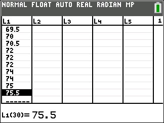
61.0 61.5 62.0 65.0 65.5 65.5 66.0 66.0
66.5 66.5 67.0 67.0 67.5 68.0 68.5 68.5
69.0 69.0 69.0 69.5 69.5 70.0 70.5 72.0
72.0 72.0 74.0 74.0 75.0 75.5
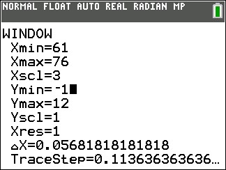
| 1. Determine the smallest class value and the class width. For this data set, I would display the data in five classes. We can set the smallest class value to 61, the largest class value to 76 and therefore the class width will be 3. |
| 2. On your calculator, enter the data into a list. Here I’ve put it into L1.
|
| 3. Go to STAT PLOT and turn one of the plots on. |
4. Select the histogram type and if necessary specify the Xlist location.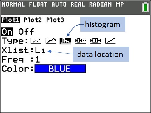 |
| 5. Press zoom and select 9 (ZoomStat). Your graph probably won’t look right, but we’ll fix that. |
| 6. Press the WINDOW button and set Xmin= to the smallest class value, Xmax= to the largest class value, and Xscl= to the class width. You might also need to adjust the Ymin and Ymax values.
|
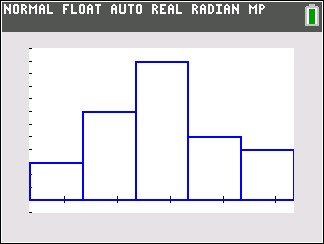
| 7. Press GRAPH, and admire your excellent histogram.
|
